Key facts
- A caption style has to work while the video moves; a good paused frame is not enough.
- Contrast, size, phrase length and safe placement usually matter more than decorative effects.
- Subvo supports preset, impact, size and preset placement controls rather than free caption dragging or timeline editing.
Quick summary
Choose caption styling in motion, not from a still. Start with readability, then check placement, phrase length, emphasis and how the style behaves over the actual footage.
Caption style is easy to judge badly. A large, colourful phrase can look impressive on a paused frame and become exhausting when it changes several times a second. A restrained style can look plain in a picker and feel clear and intentional during playback.
The useful question is not 'Which preset looks best?' It is 'Which treatment helps someone read this particular clip without losing the speaker, demonstration or story?'
Start with the footage, not the preset
Look at the finished clip before choosing typography. Is the background bright or dark? Does it change quickly? Is the speaker centred? Are products, demonstrations or on-screen graphics already using the lower part of the frame? The same caption style can succeed on a simple talking head and disappear over a fast montage.
- Mark the areas that must remain visible, such as a face, product, recipe step or screen recording control.
- Notice whether the background behind likely caption positions changes in brightness.
- Listen to the pace and emotional tone of the speech.
- Check whether existing text or graphics already compete for attention.
- Watch the clip on a phone-sized display rather than relying on a large desktop preview.
If the edit is not finished, complete it first. Trimming or reframing after captions are generated can change timing and placement. The online-caption how-to explains why the final edited file is the right starting point.
Build readability from four decisions
| Decision | Common failure | Better check |
|---|---|---|
| Contrast | Text disappears when the background changes. | Watch backgrounds across the complete preview, including bright and detailed moments. |
| Size | Captions are tidy on desktop but too small on a phone. | Test at realistic viewing size and normal playback speed. |
| Phrase length | Too many words compete with the footage. | Prefer readable chunks that can be absorbed before they change. |
| Placement | Text covers a face or clashes with interface overlays. | Choose a safe region for this composition and platform context. |
Contrast does not always require white text with a heavy black box. An outline, shadow or restrained background treatment can separate letters from footage. What matters is consistent separation as the scene changes, not a particular visual recipe.
Size has two failure modes. Small captions exclude viewers who cannot comfortably resolve them, while extremely large captions hide the video and create awkward wrapping. Choose the smallest size that remains comfortably readable on the intended screen, then seek through the whole preview to check the longest phrases.
Match the treatment to the speaking style
Fast, energetic speech can support short phrases or stronger active-word emphasis. A tutorial may benefit from calmer grouping so the viewer can follow the demonstration. Interviews and reflective clips often need captions that feel present without turning every word into a visual event.
Do not confuse activity with clarity. More animation can draw the eye, but constant movement also competes with facial expression and visual evidence. If you remember the caption effect more than the point being made, reduce the impact.
- Use stronger emphasis when individual words genuinely carry the rhythm or punch line.
- Use phrase-based treatment when meaning is easier to understand in short groups.
- Use calmer styling for dense explanations or emotionally serious material.
- Keep brand colour secondary to legibility.
- Avoid changing style simply because the next preset looks more dramatic.
Choose placement with platform context in mind
Vertical platforms place interface elements around the video, and those layouts can change. Leave breathing room near edges and avoid putting essential words directly over existing graphics. Check a draft in the destination app when placement is critical rather than relying on a permanent safe-zone diagram.
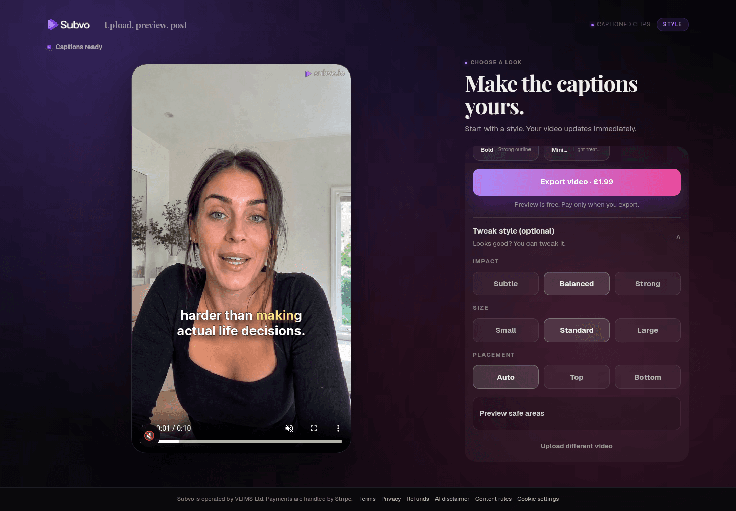
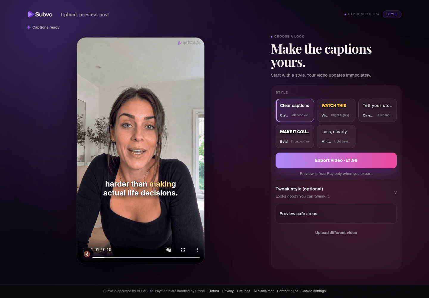
Subvo is not a free-positioning design canvas. Its style experience offers supported preset placement choices—auto, top and bottom—alongside preset, impact and size controls. Choose the option that works best for the footage shown; do not expect to drag individual captions around the frame or keyframe positions along a timeline.
Preview the style in motion
Play the whole preview from start to finish at normal speed. Review the start, visually busy sections, scene changes, longest phrases and ending. Look at timing, line breaks and how quickly your eye moves between the captions and the subject. Pause only after the normal-speed check to inspect a specific collision or unreadable frame.
Subvo lets you preview the complete video before checkout, so use that coverage. Compare styles while the footage moves, check captions against changing backgrounds, and test supported placement around faces, products, demonstrations and likely platform-interface areas. The preview guide explains how to make these checks without assuming automatic transcription is perfect.
A final caption-style checklist
- Readable on a phone at normal playback speed.
- Enough contrast across changing backgrounds throughout the preview.
- Phrases are short enough to absorb without rushing.
- Emphasis supports the speaker rather than distracting from them.
- Placement avoids faces, products, demonstrations and existing text.
- The treatment suits the tone of the clip.
- The source audio is clear enough for automatic captioning.
- The complete preview has been reviewed before deciding whether to export.
If the clip is already edited, you can try these decisions in Subvo's upload flow. Preview the whole video, compare preset, impact, size and supported auto, top or bottom placement in motion, and choose the £1.99 final export only after reviewing the complete clip.
Test the finished file in its destination
A renderer preview and a social-platform feed are different viewing contexts. After export, watch the actual MP4 on a phone and, where possible, use a private draft in the destination app. Platform controls, cropping behaviour and compression can change the balance between captions and footage.
Check the beginning, a visually busy middle section and the longest phrase you can find. Make sure the captions stay inside the visible frame, remain legible after compression and do not collide with text added by the platform. Keep the uncaptioned master so you can try a different treatment without compounding exports.
If you regularly publish a series, consistency can be more valuable than novelty. Use a repeatable size, placement and emphasis level, then change it only when the footage or tone demands a different solution. A recognisable treatment should still yield to readability on each clip.
"The best caption style lets the viewer understand the speaker without asking for attention of its own."
FAQ
What is the best caption style for short-form video?
There is no universal best style. Use one that remains readable over your footage, suits the speaker's tone, avoids important visual areas and displays phrases at a pace viewers can follow.
Where should captions sit on a vertical video?
Keep them away from faces, key products and likely platform-interface areas. Test the actual clip because the safest position depends on composition and subject movement.
Should every word be animated?
Not necessarily. Strong word-by-word emphasis can suit energetic speech, while calmer phrase or sentence treatment may be easier to follow for tutorials, interviews or reflective content.
Subvo
Try caption styles on the footage that matters.
Use Subvo's browser preview to compare supported styles, size, impact and placement on your clip before choosing a £1.99 export.
Related posts
Preview captions before paying: what a useful preview should show
A useful pre-payment caption preview lets you review transcription, timing and styling across your complete clip while keeping the paid final export distinct.
How to add captions to a video online
You do not need to reopen a full editing project just to add captions. Upload the finished clip, preview the complete video, choose a readable style, and export when ready.
CapCut alternatives for auto captions: a workflow comparison
A useful CapCut-alternatives comparison starts with the work left on your video, then verifies each product's current workflow, limits, and price at the source.